I.
This is the third time I am changing the logo of Creative Block
Blame it on me, I get bored too quickly with logos. Logos are supposed to be the so-called ‘brand identity’ for an online publication like this personal newsletter of mine. And it is supposed to be static for a consistent brand image. But I find myself skipping this cardinal rule of personal branding.
Creative Block now has a new logo with a subtle change in fonts of the publication. The rest of the newsletter, and the author (aka me), is still the same.
People change their logo when they achieve a milestone, or when they are rebranding. In my case as well, you can call it a sort of rebranding as well. I think the new logo fits the purpose of Creative Block more clearly. In fact, the idea behind the logo is perfect.
I changed the publication logo previously too. Twice actually. Each time, I thought the new logo was ‘perfect’ for Creative Block. But then after a month or so after the logo change, there creeps up a sudden thought out of nowhere: Creative Block is much more than what this logo depicts.
Hopefully, this thought won’t creep up in my head again, and I hope it sticks for at least longer than 2 months.
While you are here, I present to you the dramatic tale of past phases (and faces) of Creative Block.
a.
C and B Logo that I made in Photoshop
The logo-making process for me looks something like this.
First, I will look for inspiration - mainly asking 'what is the core idea of creative block’.
Second, I make a graphic that aligns with the ideas of CB well. I have been familiar with graphic design for more than 3 years now, so it is always the fun part for me, even if it takes the longest time.
And then the third and final most step, after the ideation and creation process, I slam the logo everywhere, including substack. Simple.
The First Logo
The first logo was a square- shaped logo with the characters C and B.
The idea being: C for Creative, and B for Blocks; thus Creative Block. Sometimes, the B character looked more like an inverted E.
I put a small circle as well. I don’t exactly remember why I had put the circle in that. But if I dig my subconscious a little further, I suppose it meant to form like one ‘eye’ when you view the logo from the right side. Potentially, the ‘eye’ of knowledge, which was inspired from the French Revolution movement.
The eye symbol represents knowledge in the French Revolution (and no, I don’t believe in Illuminati).
In my logo, this looks more like a monster than an eye of knowledge.
I launched CB in the month of December, just a few days before Christmas. I was more into reporting the latest news and analysis. I acted as a medium for people to know about the latest changes and innovation in the Tech scene - especially about AI.
I was trying out many things - improving writing, research, and the substack platform itself.
So all I did was keep the readers about new events in Tech and Science.
Then at that time, CB was the 'Tech and Science newsletter'.
b.
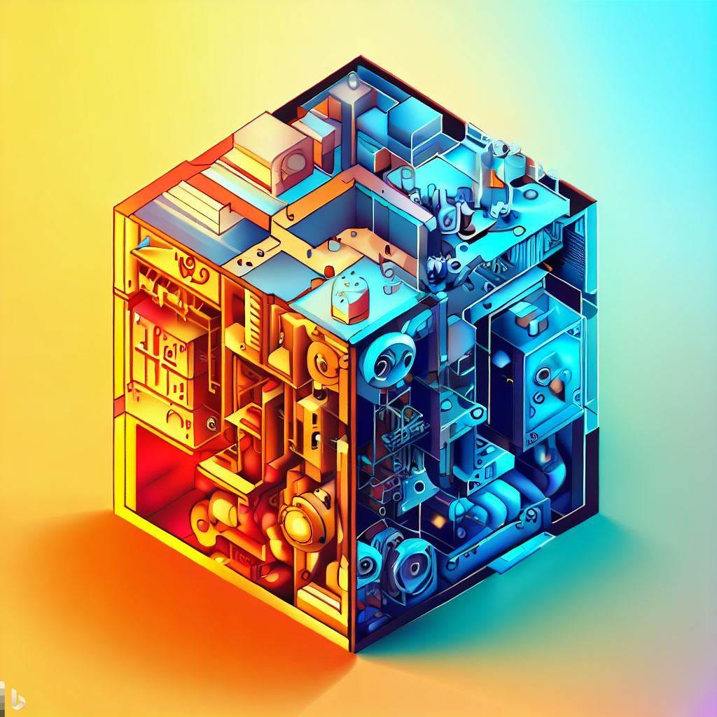
The AI Generated Cube that was lazily creative
The previous logo worked for around 3-4 months as far as I remember. Then I noticed a new trend in AI and Tech - using AI generated Illustrations. I decided to use AI generated illustrations for my posts as well.
This was also a brief phase where, unknowingly, I became the part of the AI hypers on the internet. This was a huge mistake - and I could have been less naive with my overall reporting on AI (and not trust the traditional media to a large extent).
The Second Logo
The second logo was an AI generated square block that I created using Bing Image Creator. This is a cube kinda logo, and honestly, I didn't think much of the design - nor the inspiration behind the design, nor the brainstorming. Absolutely Nothing.
I just wrote a prompt about a 'block' that looked creative enough. Hence, Creative Block.
And that prompt - with few colour adjustments and upscaling - gave me the above image.
(Now that I’m writing this, I feel this was just straight up laziness; the fact that it took me only 2 min to generate this logo)
Later I came up with some philosophy, or idea, that justified this logo. The idea was: An ‘AI’ generated Logo for a newsletter focussed (mostly) on ‘AI’.
I felt that sounded pretty good at that time. But hey, was that Naive? Maybe yes, now that I think of it. Since most of my articles were usually based on the AI side of Tech, using AI images seemed to suit well at that time.
The reason behind this using AI generated art was simple.
Firstly, I wanted to enhance the reading experience for my readers by using these artworks. Secondly, these artworks were quite easy and rather quick to make for me.
Now I realise something.
Logo designers first ideate, then plan, and then create; and here I am: generating the logo first, and then ideating.
Planning? Not at all. You wouldn't consider me typing the prompt on the Bing Image Creator as ‘planning’, would you?
Then at that time CB became an 'AI newsletter'.
II.
The New Logo
So nearly 2 months passed I believe.
I improved my writing a bit (though I have a long way to go), and improved my analytical research skills. I now understand the innovations, ethics and the fundamental principles of AI much better.
And now, once again, I am changing the logo of this publication.
(I hope this ain’t going to be naive again)
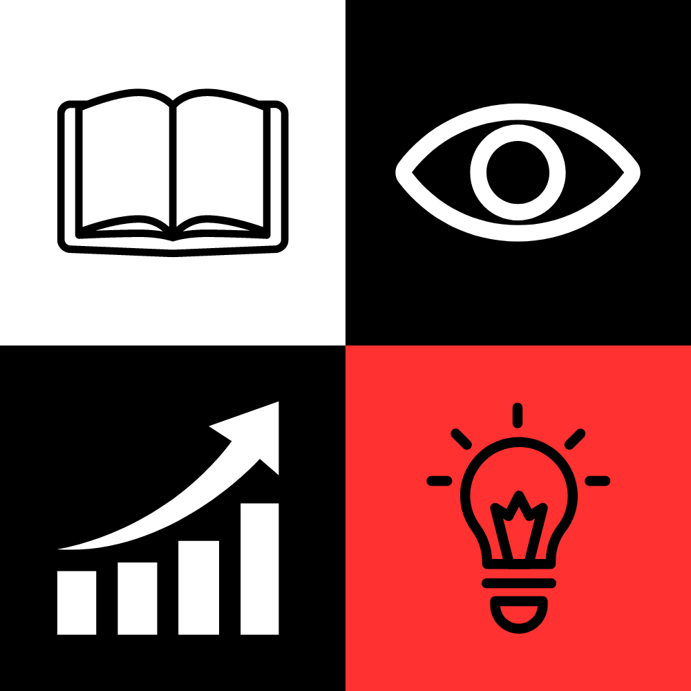
Here is the new logo:
Just like before, I would most probably explain the idea behind this logo at some point in the future; maybe when I change the logo again in the future. (which I hope I don't. I really want to stay committed to this one).
Just a brief description.
The four symbols you can see in the logo are partly inspired by the four divisions of creativity, according to the Four-C model by Kaufman & Beghetto, 2009.
The Four-C model of creativity, in very brief manner, states that creativity is hypothetically divided into 4 parts:
Mini C - which attributes to one's personal and novel interpretation of events
Little C - which attributes to those creative acts that bring value to you and your peers in your circle.
Pro C - which attributes to creativity amongst professionals, who use it in their respective professional fields and professional life
Big C - Which attributes to creativity that creates an huge impact in the world
So now, this is in actual sense the blocks of creativity. Thus, being 'Creative Block' (once again).
I want to make it clear that I am not fully satisfied with the four-c model of creativity. It seems too hypothetical to me. Creativity, according to this model, is categorised into different phases of life; the fact the mini-c is when you were a child, little-c when you are in your school and academic life, pro-c in your career life, and then big-c is the ‘make it big‘ phase of your life.
I believe creativity is better expressed when you infuse the ‘non-creative’ skills into it - like analytical, statistical, and logical skills overall.
You would consider maths as a logical subject, and painting as a creative subject. But ask a mathematician, and you will realise that they devise creative problem solving strategies. Ask an illustrator, and you will notice them using anatomy to draw beautiful creative figures.
Playing with logic, while being creative, is really interesting and fascinating to me. Einstein once said: “Creativity is Intelligence having fun”
Now, Creative Block is “AI, Tech and Science Newsletter”.1 And I am aware; AI is a subset of Technology, and Technology in turn a subset of Science.
III.
Summing it up
You have made it this far.
This post is longer than I expected. I didn’t realise that writing about a few logos and my incredible mistakes would take me more than 1500 words.
But the fact is, now that we are at the end of the post, here are few final thoughts -
Initially, I didn't want my readers to pay more attention to the logo, your subconscious would do it better. I wrote this as an update post - just to inform the sudden change of the logo.
Of course, I didn't mention the philosophy, nor the idea, behind these logos before. I thought, for what I have read and known, it would be absorbed by your subconscious better.
The content of this publication is what defines CB; not the logo, and also not the apparent ‘branding’. The quality content of the newsletter was free, and will continue to be free. So ‘branding’ is not something I want to take into consideration much.
My readers, like before, focus on my articles, insights, and the overall value they receive. Except for a few sudden confusions, I don’t think writing this post would have changed anything to the publication.
Creative Block is the same; just the logo is changed (and few formatting related to the font and link colour, to match the logo)
Well, that’s it for this very short UPDATE post of 1500 words. See you in the next article.
When I am writing this, I am surprised to see that the word Creative Block has three different interpretations for these three logos.
For all the times that I changed the logo, the change in meaning of the word Creative block was spontaneous - as in not much thought was put into them. And now, looking back, it seemed that each logo had a meaning of its own.
I don't care what you say, but I'm proud of myself.


